ZETA DESIGN SYSTEM
ZETA DESIGN SYSTEM
CLIENT Zebra Design Team
STATUS In production
TEAM Mike Kaminsky, Salena Nop, Ben Kennedy & Usman Hafeez
ROLE UX & Systems Designer
DELIVERABLES Design System in Figma, React & Flutter
Zeta is a design system that enables consistency, direction & resources for designers & developers across industries, business units & platforms.
THE HISTORY
Zebra Components & Icons
This was a component & icon library originally made in Sketch & migrated over to Figma. Mainly built off Material Design with some small changes for retail & warehouse UIs.
Zebra Design System
This was created with the design team in conjunction with Athlon incorporating Figma’s newest features at the time including auto layout, variants & nested components.
Zeta Design System
This is our current design system connected with Figma’s latest feature: Variables. Iterated off of Zebra Design System but with a focus on accessibility & modularity.
THE PROBLEM
Toooooooo many products, not enough consistency.
At Zebra, we have products within our enterprise mobile computing, software as a service, application tracking software, vision guided robotics & many more. All of them have their own set of unique styling & requirements. This led to many of our products feeling dissimilar & lacking consistent patterns, typography & elements.
The Zebra Design System (and later on Zeta Design System) was born to help create a single source of truth for what it means to be a Zebra product. We learned from the variety of form factors & industries each of our products live in & aimed to create something that could be leveraged across all of our design teams.
Our Process
We wanted to make a process that is simple, intuitive, and inclusive.
Our process has gone through many iterations and we’re constantly experimenting with it. We’ve also experimented with forms of automation for requests- creating a Microsoft Form that designers can submit component requests that automatically creates a ticket in our JIRA backlog. We’ve also been working towards getting our product management team involved with product specific component additions.
Foundations
The building blocks of our design system.
Spacing + Grid | Color | Typography | Icons | Components
Spacing + Grid
We built our spacing off a 4px layout grid. This allowed us to have the versatility of small increments & the scalability to control density.
Color
For our colors, we focused on a palette that is clean & concise while being AA & AAA accessibility compliant. We built a grid for both light mode & dark mode inverse to one another, keeping their inherent contrast ratios.
Typography
Our typography utilizes IBM Plex Sans, which is a clean & distinctive typeface that’s designed for digital world use cases. We built our type scale off of our 4px grid utilizing proper line height & type sizes, but still offering versatility for different component types & platforms.
Icons
Our icons were based off the Material Design icons but also feature unique Zebra specific brand & product icons. We aimed to keep them clear & concise so our users won’t second guess what something means. Fun fact: one of our developers has built an icon repository site for dev exports (iOS, Android, Web) that uses automation to check our icons in Figma weekly & add any changes!
Components
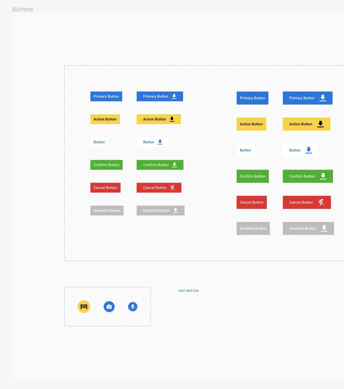
Our components are the culmination of all of our foundations- adhering to our grid, following our spacing, utilizing our typography, built off our colors & embedded with our icons. We’re constantly adding & reworking our components as many of our designers across our products have a variety of different use cases & customer needs that feed back into our design system.
ADVANCED FEATURES
As we grew our design system, we began to incorporate Figma’s advanced features.
Auto Layout | Variants | Variables
Auto Layout
This was the first advanced feature we rebuilt all of our components with. This allowed them to automatically stretch & grow while following a more consistent padding & spacing system.
Variants
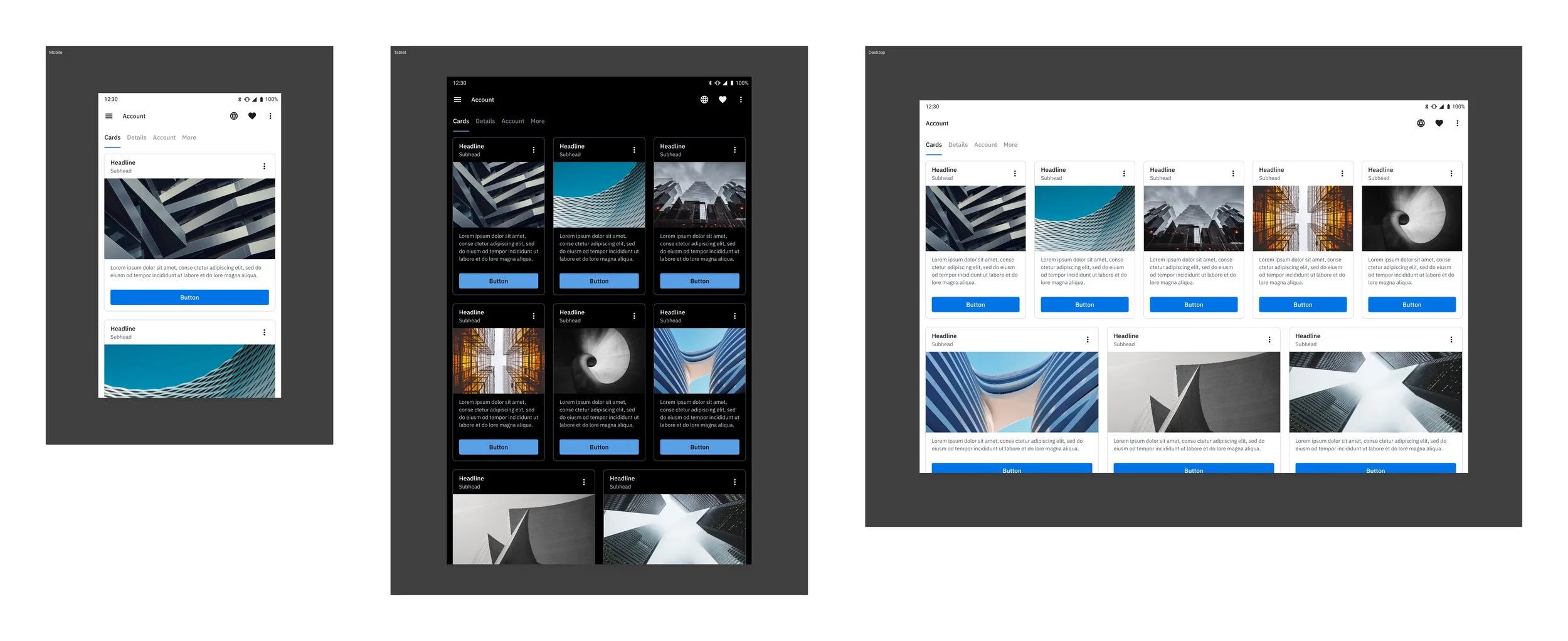
This was one of the most vital features that we built into our system- especially with the inclusion of nested variants & later on boolean component properties. We redefined the possibilities of the different types of components we had for buttons, list items, cards, navigation & anything in between.
Variables
This is a predominately new feature that we’ve been experimenting with & slowly connecting throughout our entire system. This allowed us to have an inherent light & dark mode as well as theming. Lastly, we’ve also been able utilize it for multi-platform components. More on this in the next section…
Variables Deep Dive
Fundamentally the most powerful & transformative new Figma Feature for our design sytem.
Primitives | Semantics | Theming | Platforms | Retrofitting
Primitives
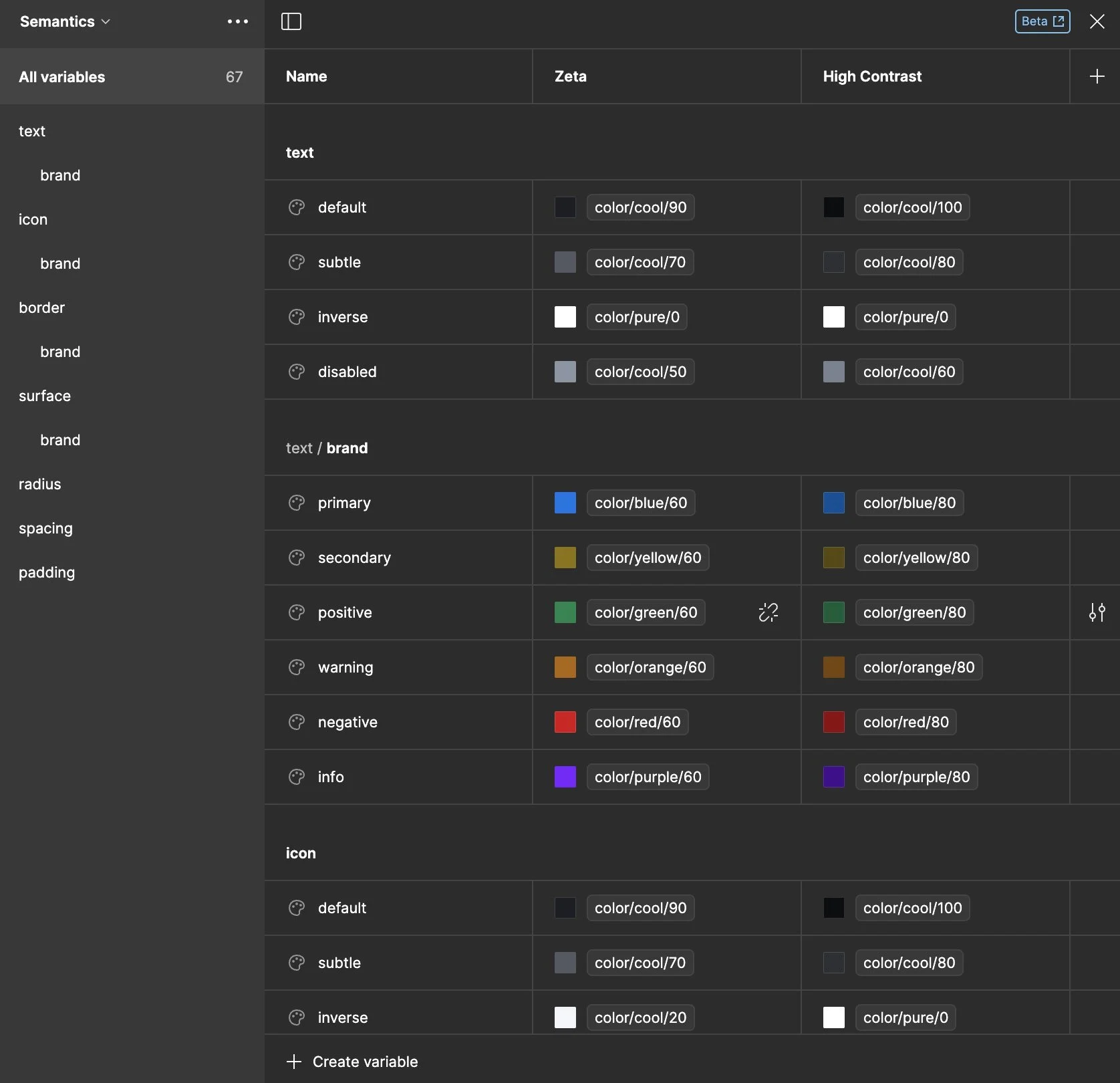
We decided to do something different with our primitives. We utilized our inverse color grind from our previous system & used that to become the foundation for our primitives. This allowed us to have an inherent light & dark mode for every single semantic token, theme & subsequent collection. There are certain cases where we’ve had to change a primitive value, for example color/cool/80 in dark mode because we felt the slightly lighter value worked better than its original inverse value.
Semantics
Our semantic collection is currently the highest layer within our tokens. We do plan to do some component specific colors but for now we’re utilizing our semantics & adding tokens when necessary. Each of our main category has a brand section that includes our color values & are also set up to only show up contextually for each type of content. For example, text color tokens only show up when changing a text color.
Theming
We have started building out themes for our design system. Our first theme is a high contrast mode. This focuses on a AAA accessibility with high contrast & sharper edges throughout. We’re looking to utilize this as a optional mode for our customers. As mentioned previously, this theme has an inherent light & dark mode due to the way we have set up our primitives & any future theme will also benefit from this.
Platforms
We’ve been experimenting with platform specific variables for our components. Currently we’ve setup boolean properties to show & hide certain elements for different platforms. We conducted an audit on all of our screen resolutions to utilize Figma’s max-width & max-height frame sizes. This allows us to always make sure that our components will look & feel good for all of our products.
Retrofitting
To make the transition much easier for our designers, we’ve gone through & connected our previous color styles with our variables. This allowed them to detach & keep the variables but also gain the benefits of variables without much less upfront effort. This has also made it easier for us to go through our component library & convert each component set to solely variables.
Results
Zeta Design System is now being utilized across many products within our portfolio, ensuring consistency & updating our core experiences for our customers to really see our stripes. We’ve built code libraries of our design system in Web (React), Flutter & Android (for legacy apps). Our front end UX team has also been working diligently with us to launch Variables in code!
Web (React) | Flutter | Android


